AXA Fixed Assets .
I led the strategy and design of a B2B risk management platform for AXA, turning an initial request for an interactive asset map into a broader product vision that helped enterprise customers monitor threats across warehouse portfolios, coordinate responses more effectively and reduce exposure before incidents became claims.
Core business objective: help AXA move from reactive insurer to proactive risk partner by giving customers clearer visibility of portfolio-level risk, practical recommendations and a more coordinated way to respond to emerging threats.
Collaborators: AXA stakeholders, enterprise risk managers, local site operators, product teams, Zensar engineers and cross-functional design partners.
The problem .
AXA’s original brief was relatively narrow: create a map-based experience that would allow customers to view insured assets across their warehouse portfolio in one place. But through discovery it became clear that visibility alone would not solve the real problem. Large organisations did not simply need to see where their sites were. They needed a better way to understand risk across a portfolio, coordinate action quickly and reduce the likelihood and impact of claims.
The challenge was not just to design a better interface. It was to reframe the product from a monitoring tool into a more strategic platform that could support decision-making, preparedness and response at scale.
AXA was paying out millions in claims linked to natural disasters and other high-impact events. The original ask focused on visibility, but visibility alone would not solve the underlying issue. A map could show where sites were, but it would not help businesses respond faster, plan better or take practical steps to protect stock and operations. The real challenge was behavioural as much as operational: how could AXA support customers in taking the right action at the right time?
User needs
- Clear visibility of portfolio-wide risks
- Faster coordination between central risk teams and local sites
- Timely alerts and practical guidance
- A more useful way to monitor, plan and respond across multiple location
Business needs
- Reduce avoidable claims and payout risk
- Encourage more proactive customer behaviour
- Strengthen AXA’s role as a long-term risk partner
- Create a more valuable service proposition than a simple asset map
Problem statement
AXA needed a risk management platform to help enterprise identify threats earlier, coordinate responses faster and take practical action to protect their people, stock and sites.
Defining success early .
Before shaping the experience, I worked to make success explicit. The brief was open-ended, so it would have been easy for the work to remain at the level of features. Instead, I helped define a clearer direction for the product: one that balanced user value with AXA’s commercial incentives and turned a loose request into a more strategic proposition.
What success looks like
- Customers should be able to understand risk across their portfolio from one place
- The platform should support action, not just visibility
- AXA should be able to guide customers towards better risk behaviours over time
- The experience should feel like a coherent product rather than a collection of disconnected tools
This of course gave me a clear framework for strategy and delivery.
The research .
Discovery
Through face-to-face interviews, we learned that many insured businesses already had dedicated risk managers responsible for protecting sites, stock and operations. Their role was not passive. They were expected to anticipate problems, prepare contingency plans and respond quickly to a wide range of risks, from natural disasters through to theft, protest and unauthorised access.
That insight changed the direction of the work. A map still had value, but it could only ever be one part of the solution. The real opportunity was to design a platform that helped these teams monitor risk, coordinate across locations and receive more structured support from AXA.
User Pain Points
- Limited ability to coordinate across multiple sites from one place
- Slow or fragmented communication during emerging incidents
- Too much reliance on manual planning and dispersed information
- Not enough actionable guidance tied to real portfolio risk
Acceptance Criteria
- One central place to monitor sites and emerging threats
- A clearer structure for alerts, recommendations and response planning
- Better communication between portfolio teams and local managers
- A product model that supports both day-to-day preparedness and live incident response
How Might We (HMW)
As a result, I summarised the research into clear How Might We questions.
They brought focus to the problem, gave the team tangible ideas to test and helped shape the roadmap for iteration.
HMW help AXA customers reduce claims by making it easier to take successful action to protect their sites and stock?
HMW turn AXA’s expertise into a more proactive service rather than a reactive insurance relationship?
HMW create a platform that supports monitoring, collaboration and decision-making without overwhelming already busy risk teams?
Development .
I led the product direction through a strategic UX and UI approach, helping the team move beyond the original map concept and shape a broader platform structure. The work focused not only on interface design, but on defining what the product should actually be and how its parts should work together in a meaningful way.
Shaping the product around action
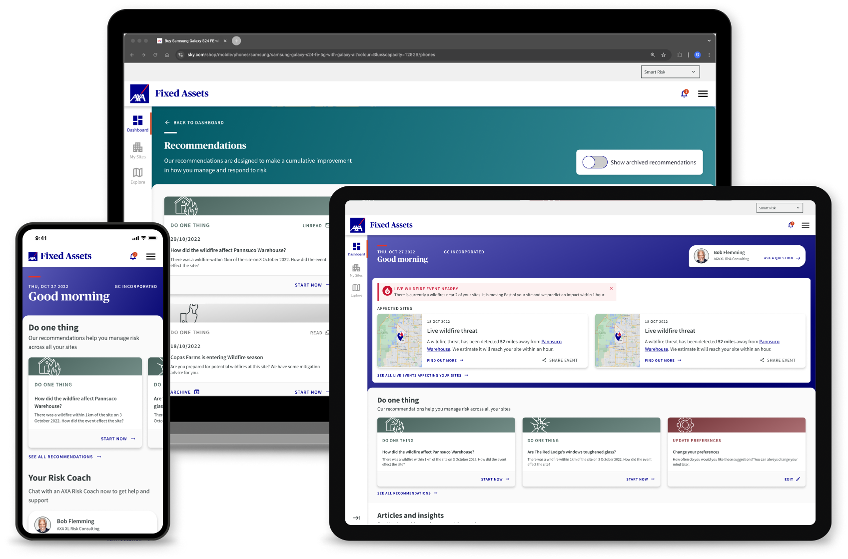
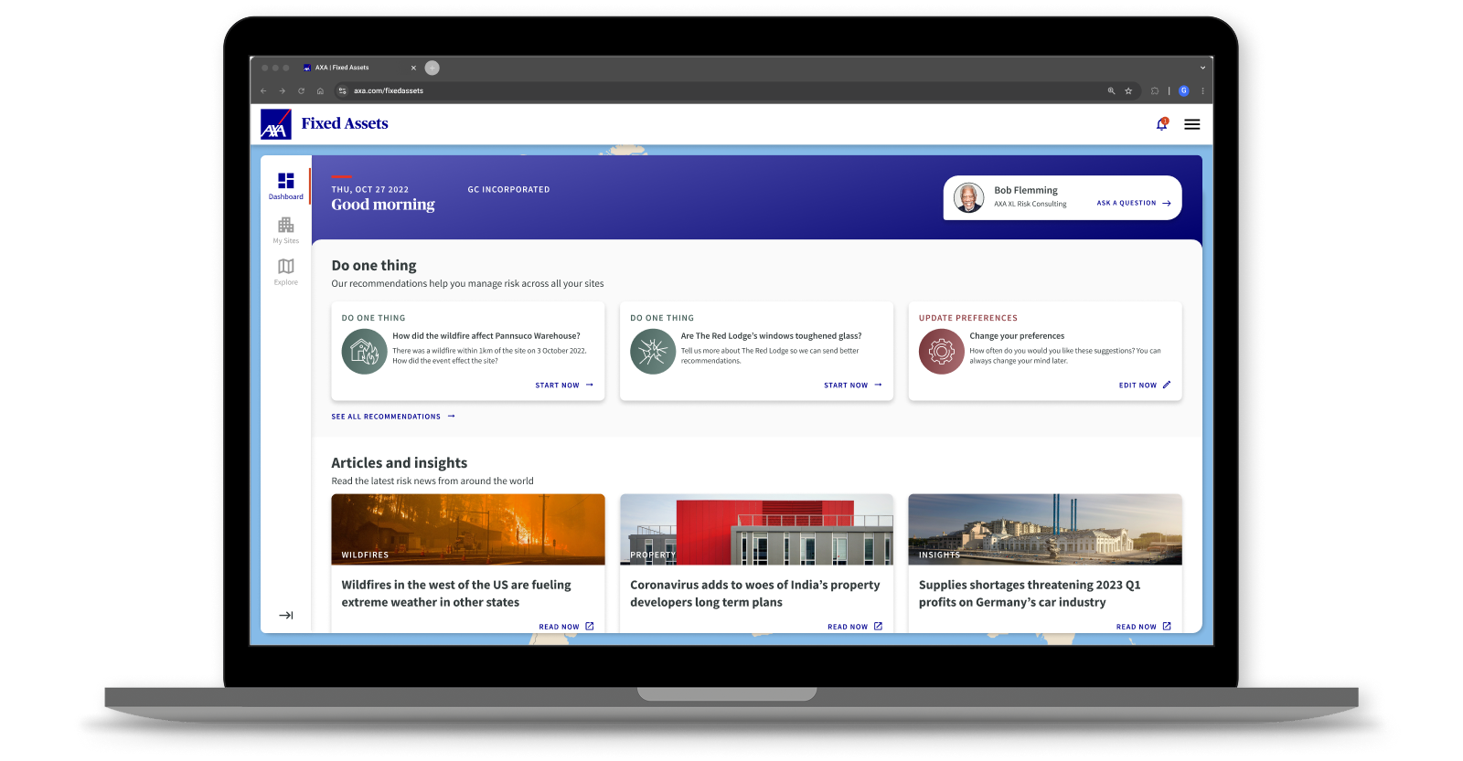
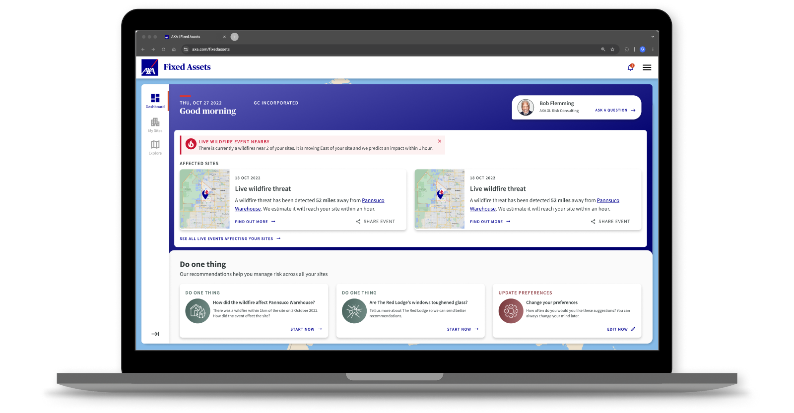
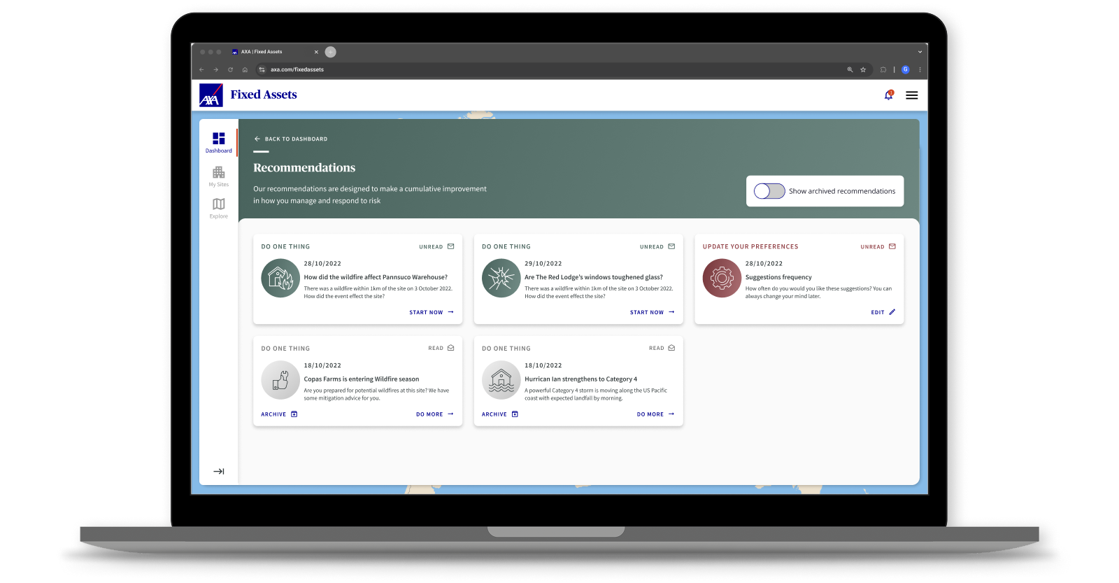
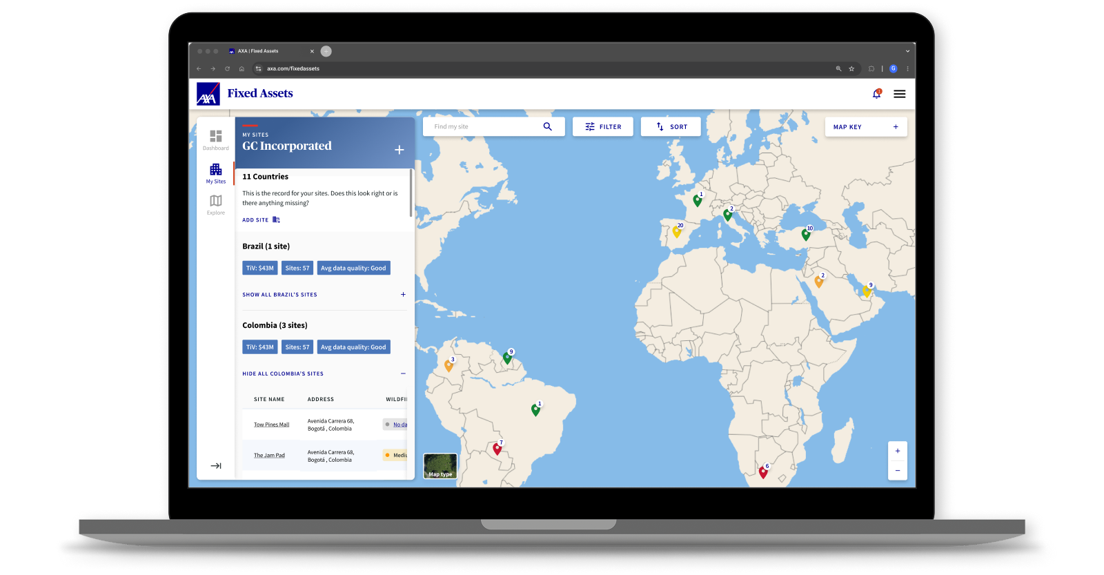
The concept evolved into a platform organised around four main areas: Dashboard, Recommendations, My Sites and Explore. Together these created a clearer operating model for risk managers, combining portfolio visibility, guided action, expert support and wider situational awareness.
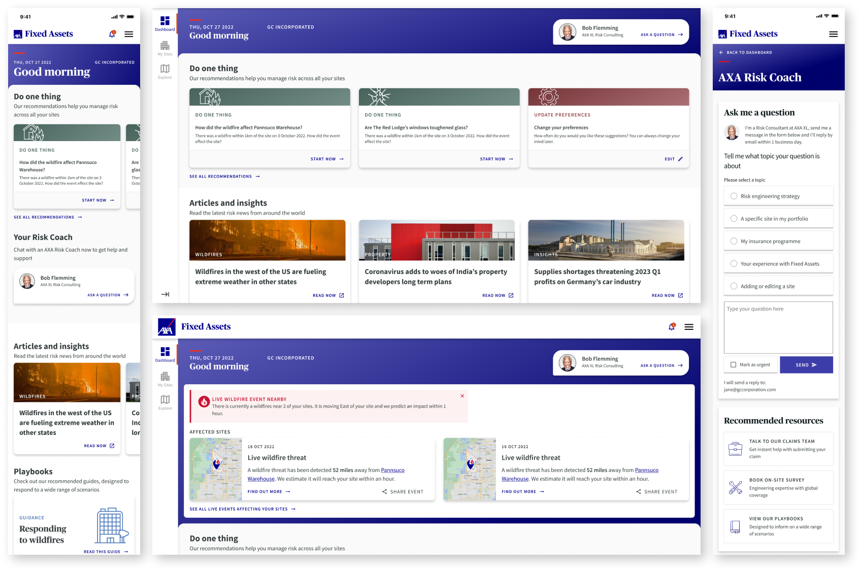
The dashboard became the central working space, bringing together alerts, guidance, playbooks and a Risk Manager Coach concept to help users understand what mattered and what to do next. Rather than forcing users to piece information together across different areas, it created a more focused starting point for decision-making.
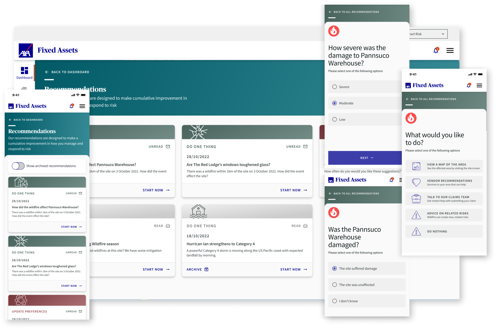
Recommendations extended that further. Instead of leaving risk managers with raw information alone, the platform introduced more practical prompts and suggested actions that could help them reduce exposure over time. This shifted the product from passive monitoring towards behaviour change and ongoing risk reduction.
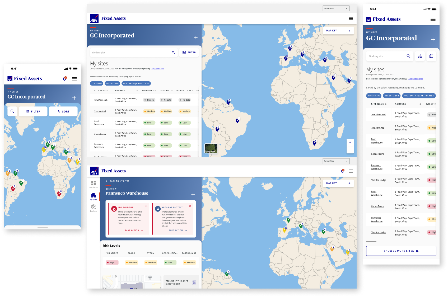
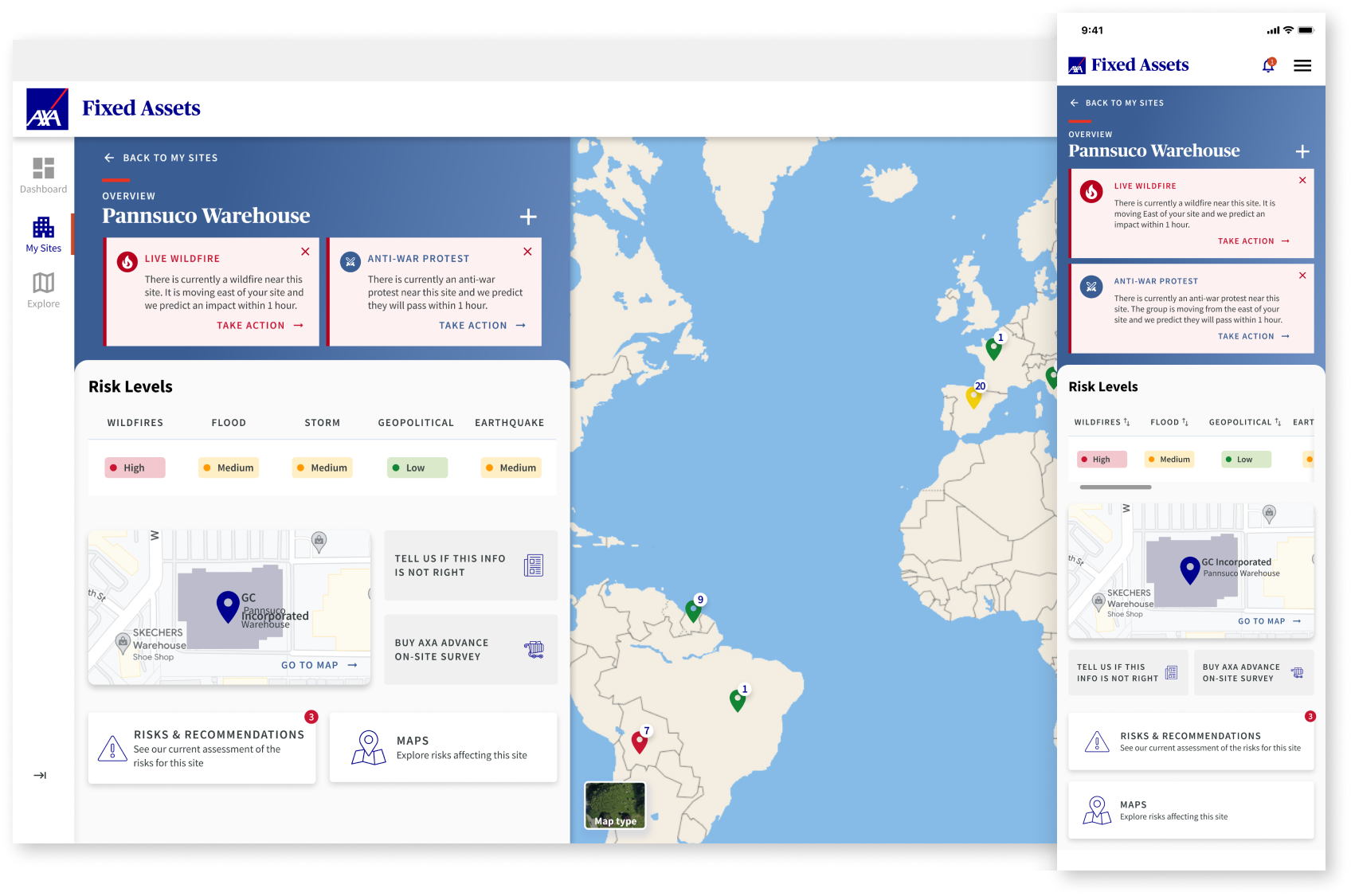
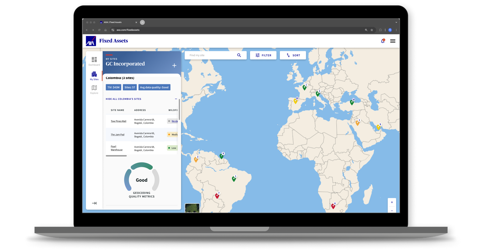
My Sites kept the original mapping capability, but repositioned it as part of a wider workflow. Risk managers could view their portfolio, understand site status through colour-coded severity levels and coordinate directly with local managers when attention was needed. This became less a map for observation and more a portfolio control layer for managing distributed risk.
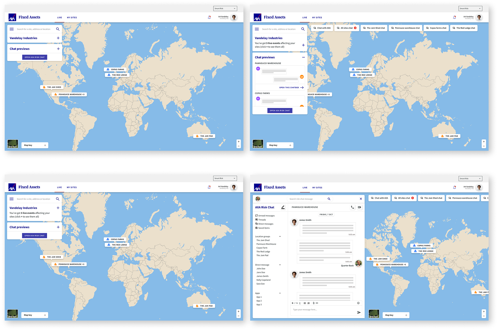
Finally, Explore extended the platform beyond a customer’s own estate. It created a broader window into global events, articles and playbooks so users could better understand emerging patterns of risk and prepare with more context.
Test & validate .
Because this was an open-ended product proposition rather than a simple feature redesign, validation was as much about strategic confidence as interface quality. I used workshops, iterative reviews and close collaboration with stakeholders to test whether the concept was solving a more meaningful problem than the original brief.
The strongest signal was that AXA responded positively to the reframed direction and chose to evolve the concept further, including continued work with Zensar around the AI layer supporting the product. That gave the work traction beyond design and helped confirm that the broader platform vision was commercially and operationally relevant.
Impact and why it matters .
The most important outcome of this project was the strategic shift it enabled. What started as a request for an interactive map became a much broader product vision: one that gave AXA a more credible path towards helping customers prevent losses, not just respond to them after the fact.
It also showed the value of design leadership in ambiguous environments. The work was not about polishing a predefined brief. It was about identifying the real opportunity underneath it, reframing the product around that opportunity and giving stakeholders something more useful, more commercially meaningful and more likely to create long-term value.
What I learned
The biggest lesson was that some of the strongest product opportunities sit behind the surface brief. In this case, the real value was never in the map itself. It was in designing a clearer operating model for how enterprise risk teams could monitor, communicate and act with more confidence across a complex portfolio.
What's next
The concept already pointed towards a stronger future product: deeper personalisation, more intelligent recommendations, richer incident playbooks and a more mature AI-assisted support layer. The foundation was there for AXA to keep evolving the platform into a more proactive risk service over time.
Results
2%

3.15%


