Core service rebrand
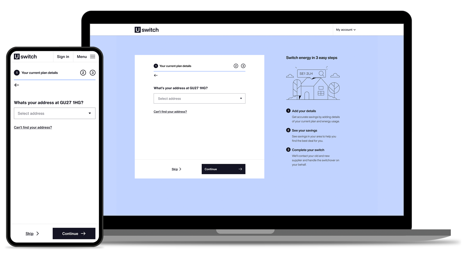
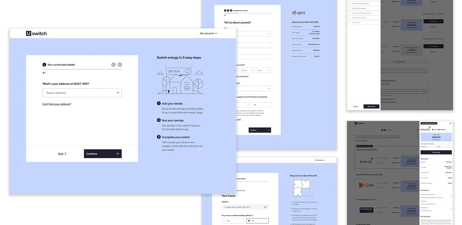
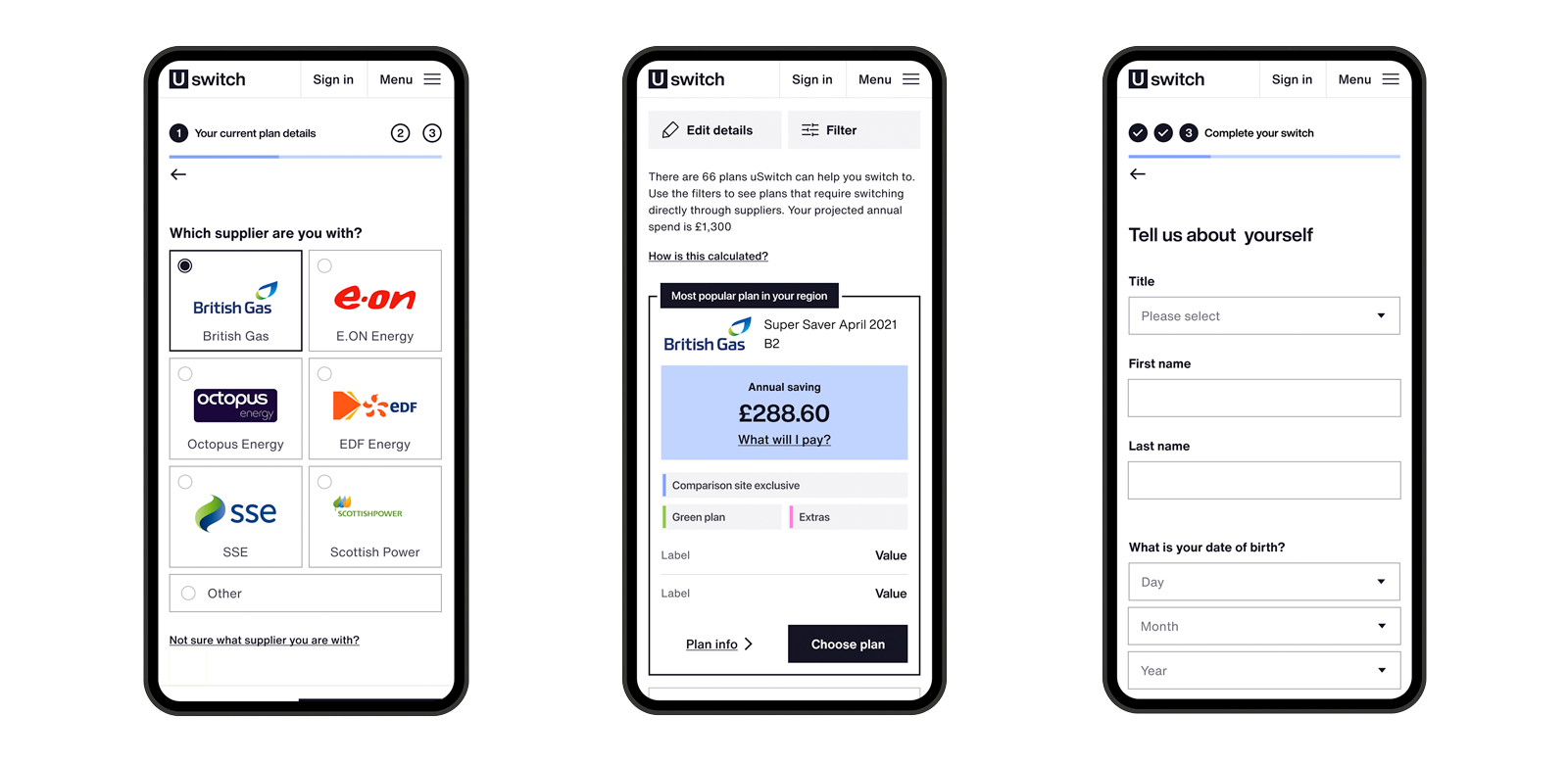
After the rebrand our main focus was to optimise the Energy Switching Journey, our core service and thanks to which our customers loyally engage with us.

The challenge
We had already spent a valuable amount of time in making the process mobile friendly — uSwitch (note the former spelling) mobile first — now it was the time to tie it in with our new brand's proposition.
The Energy Switching Journey was and is a well oiled process, which existing and new customers find very easy to follow all the way through completion. This proved a great exercise, as it enabled us to test the applicability of our new Design System and to amend or rethink those assets that proved complicated and fiddly to use.
Thanks to all this exciting work, we are now in the process of expanding and applying the Design System to other of our inhouse brands.


Results
2.45%

4.75%


