Talking made simple
I redesigned Habitat's newsletter templates to modernise the brand, improve efficiency and deliver a consistent responsive experience across desktop and mobile devices globally.
A modular system, image-led layouts and refined components reduced production time, expanded smartphone reach and consistently lifted engagement, click-through rate and retention week-on-week.
The challenge
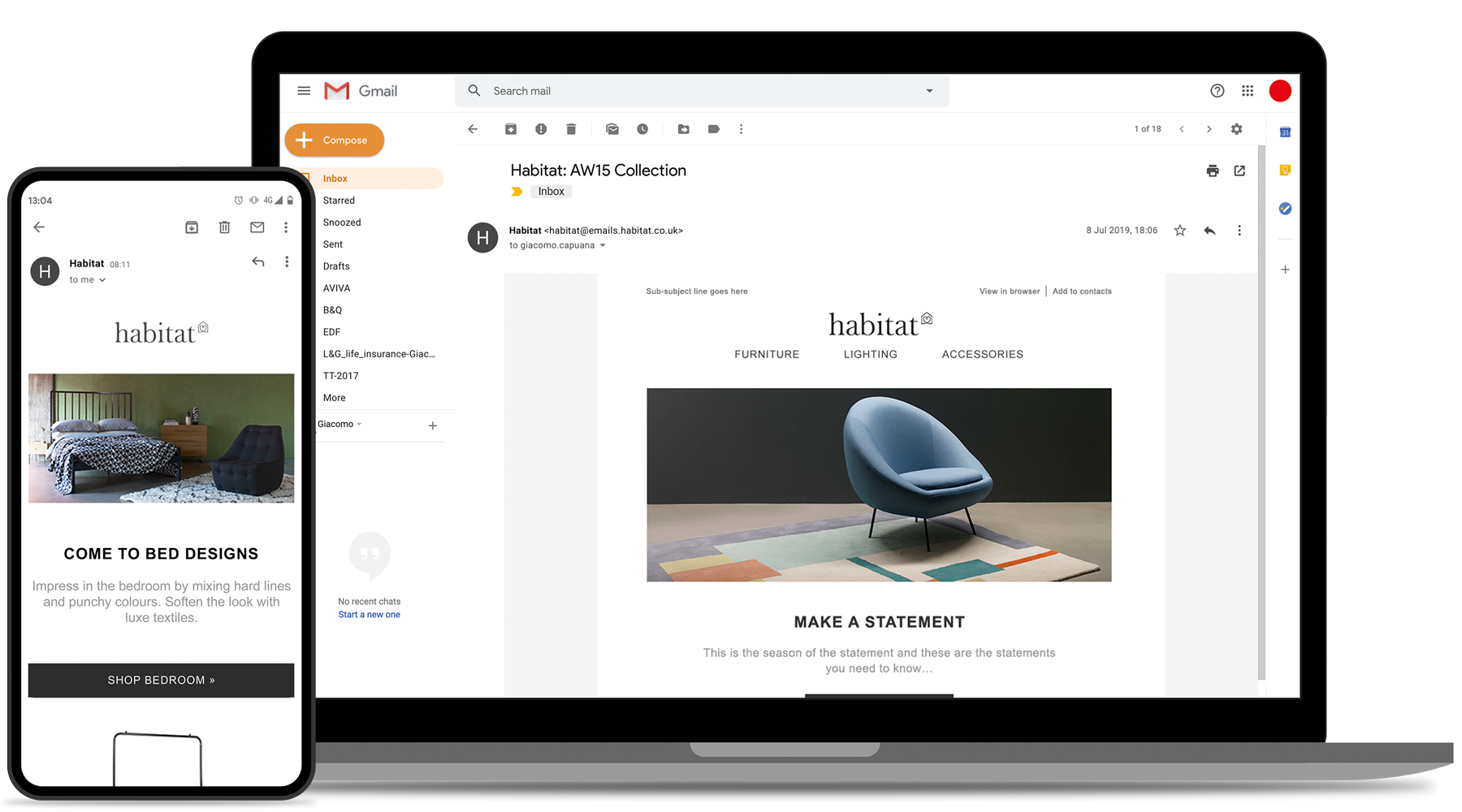
Redesigning our newsletter templates at Habitat was another rewarding piece of work. The project had been postponed during the months spent replatforming and redesigning the website, leaving the existing emails outdated and inefficient. In brief:
- The old templates were not responsive, which meant managing separate desktop and mobile versions was time-consuming and error-prone
- Production and campaign execution were slow, limiting our ability to target a broader range of smartphones rather than only older devices such as the iPhone 4
- Visually the templates no longer represented the new website or the refreshed brand identity, causing inconsistency across digital channels
Approach & solution
I led a focused redesign to deliver responsive, brand-consistent templates that sped up execution and improved audience reach. Key elements included:
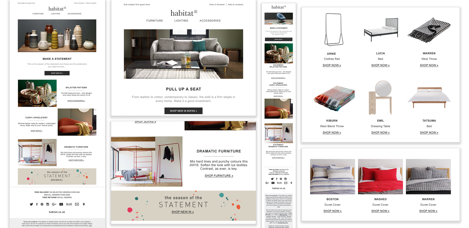
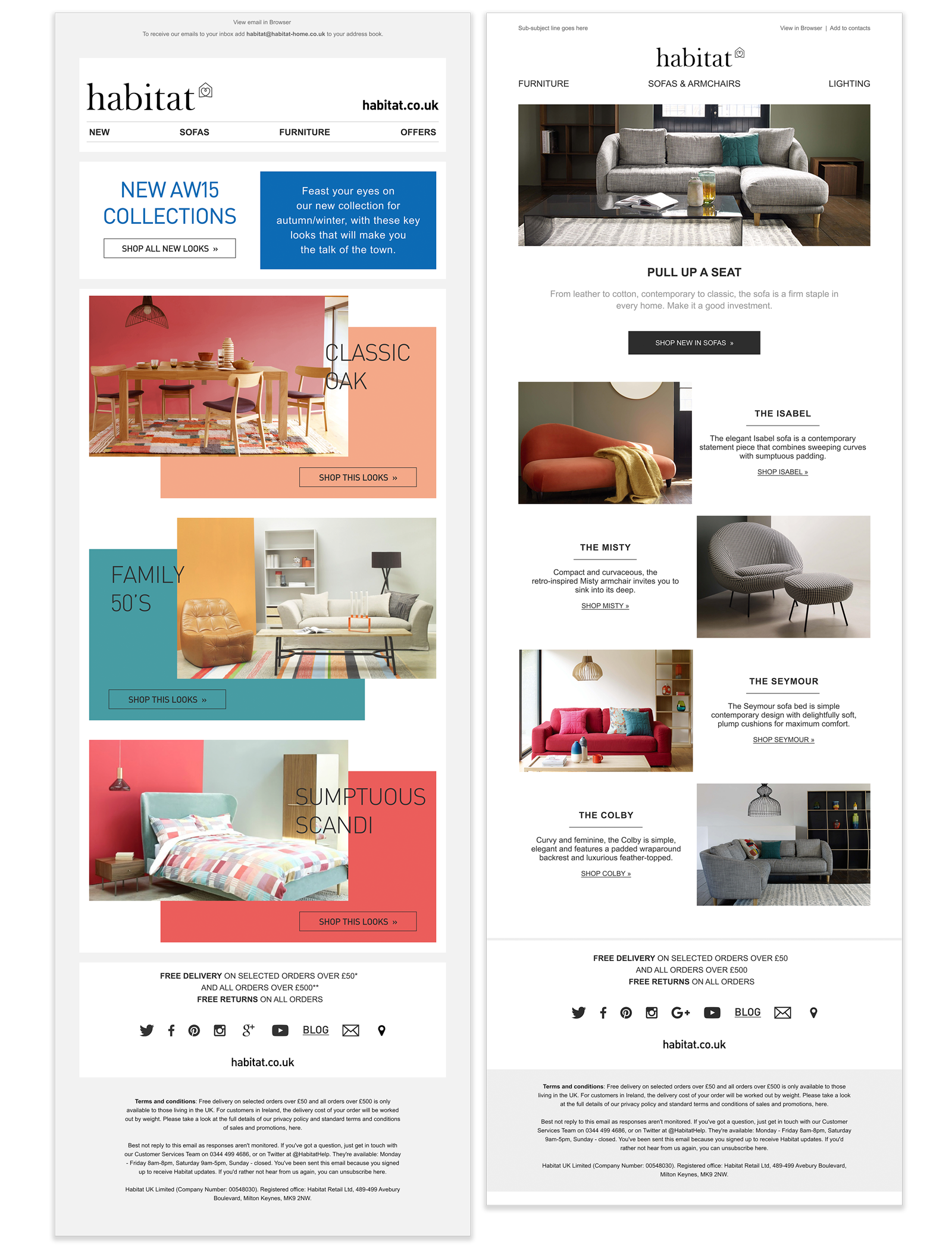
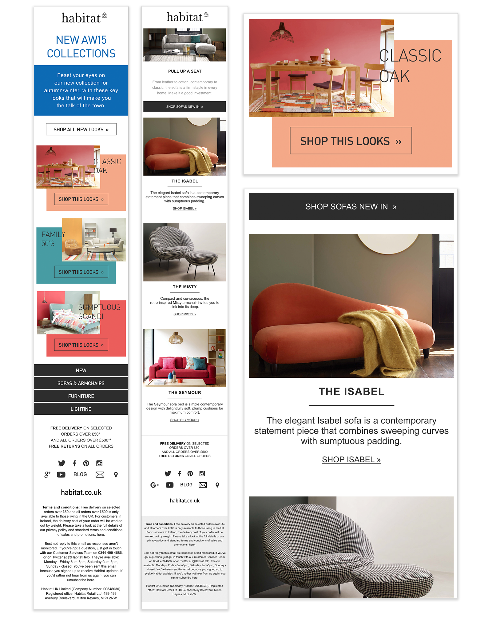
- Modular structure — interchangeable rows to speed composition and reuse: 12 rows for Habitat Voyeur newsletters and 5 for Habitat Features newsletters
- Image-led layout — articles were driven by photography, so each photoshoot was planned with meticulous art-direction and executed by professional photographers to ensure consistency and editorial quality
- Design System extension — the email components were developed as part of an expanded Design System so the same patterns and components could scale to future pages and campaigns
- Efficiency and targeting — templates were rebuilt to be fully responsive, reducing duplicate work and enabling campaigns to reach more smartphone users across device types
Creative direction & production
Given the image-led nature of the newsletters, I directed photoshoots and set guidelines for cropping, aspect ratios and hero treatments so imagery translated reliably into the modular email rows.
This reduced iteration between creative and development and ensured the visual story in each email matched the look and feel of the new website.
Outcome & impact
Subscribers responded positively and the metrics showed clear improvement after launch:
- Engagement rose by 4.32%
- Click-through rate increased to 3%
- Unsubscribe rate fell by 1.2% week-on-week
Final thoughs
In summary, I:
- Led the redesign and implementation of responsive newsletter templates
- Devised the modular row system and coded the component set with the development team
- Directed photography and established image standards for email use
- Integrated the email templates into the broader Design System so patterns could be reused across future projects
- Measured and reported post-launch performance to iterate where necessary
Results
4.32%
3%
1.2%


