uSwitch mobile first
After extensive analysis, we discovered that most of our customers would begin their search with their smartphones but never go through the whole funnel.
Only once they’d login through their desktop, supposedly at home, customers would then complete their switch.
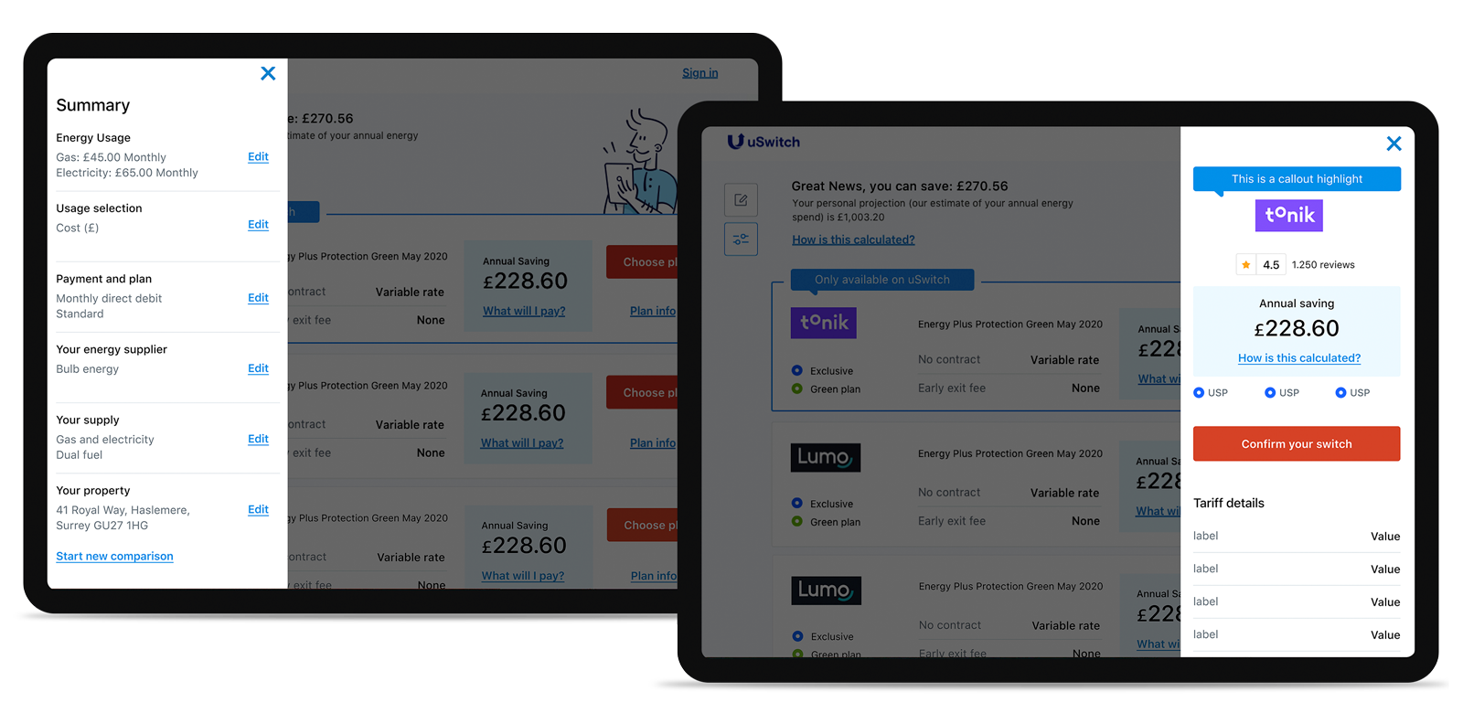
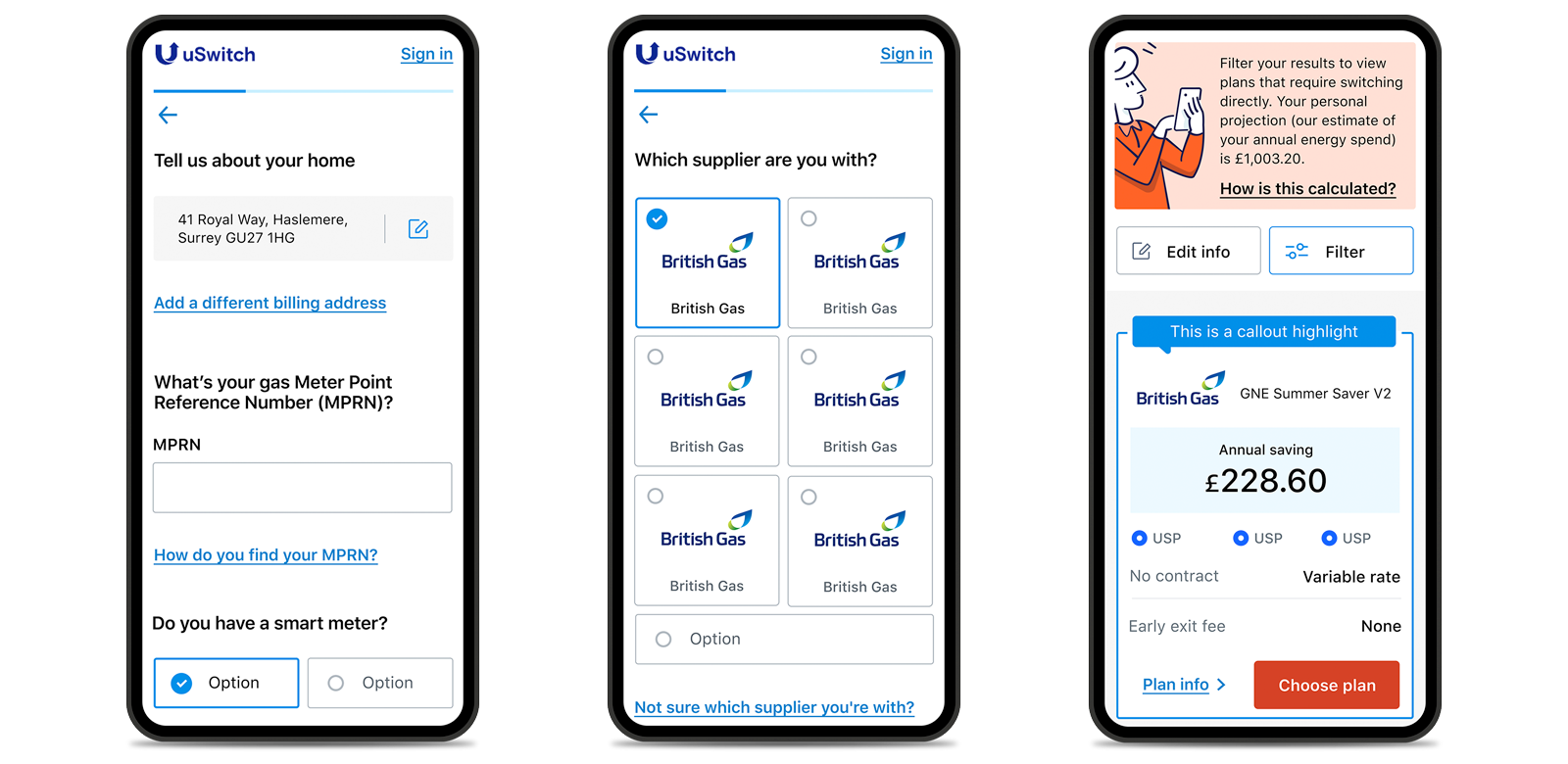
As we understood later on — through quantitative and qualitative research — it was obvious that our mobile journey was very difficult and frustrating to use. After all our mobile site was the result of a design that had focused on desktop, which implied that most features would be hidden on mobile; a bit of an old school approach.
This prompt us to rethink the entire experience starting from mobile and tablet view ports, which paved the way to solutions that have increased our conversion rates by 0.2%.
I worked with the UX Designer (I was the project lead) by setting up and facilitating workshops, design sprints, as well as helping with the testing.
I then translated the resulting wireframes into HI-FI designs for our engineers to develop and promptly test and verify our assumptions.

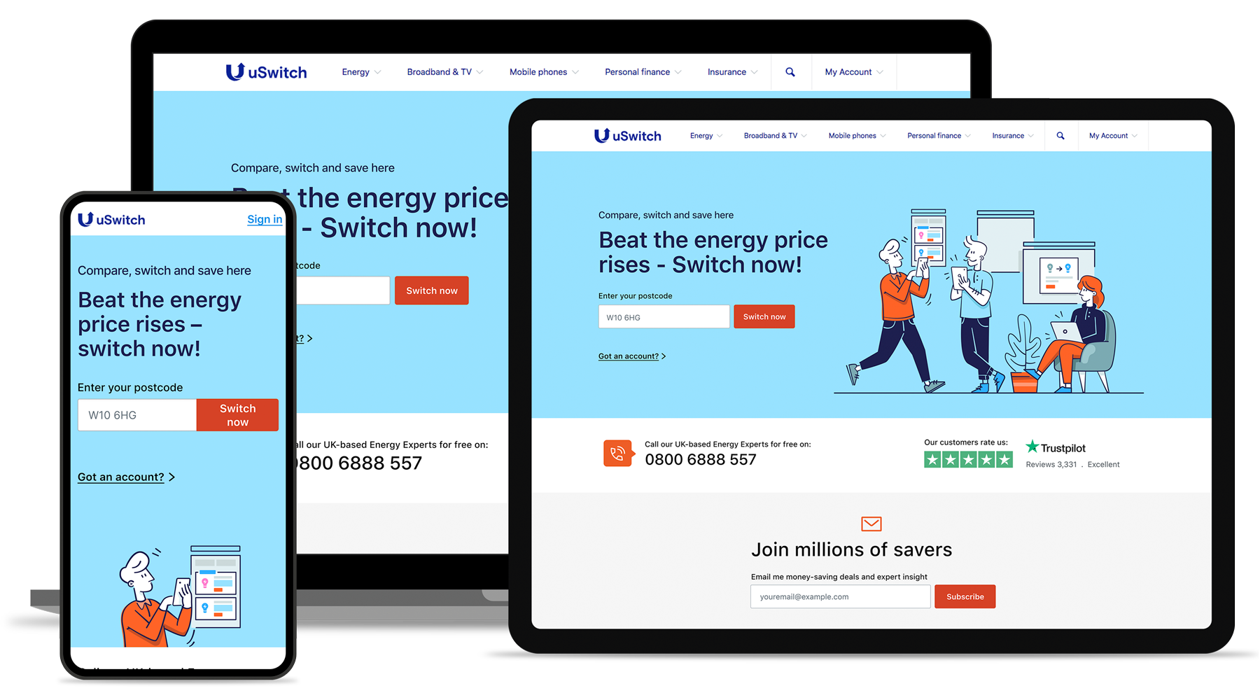
No changes were applied to the Energy homepage from a UX or back end point of view (see image above), however significant details were removed and some were added to the UI.
I worked on a whole new set of illustrations to give the site more personality, whilst making it friendly and warmer to the user.
I also invested a considerable amount of time to declutter adding more breathing space and making use of typography to set a more direct yet friendly tone.