New customer services
By the end of January 2021 the Uswitch Senior Leadership Team (SLT) decided it was time to invest in one of the business areas they hadn’t given too much importance in the past. They wanted to push the Mortgages Comparison Journey, in particular Remortgages through their partnership with Natwest.
It’s at this point when I temporarily joined the Financial Services team and together with the Product Owner, the Product Designer and the Content Editor we strategically scoped-out our work.
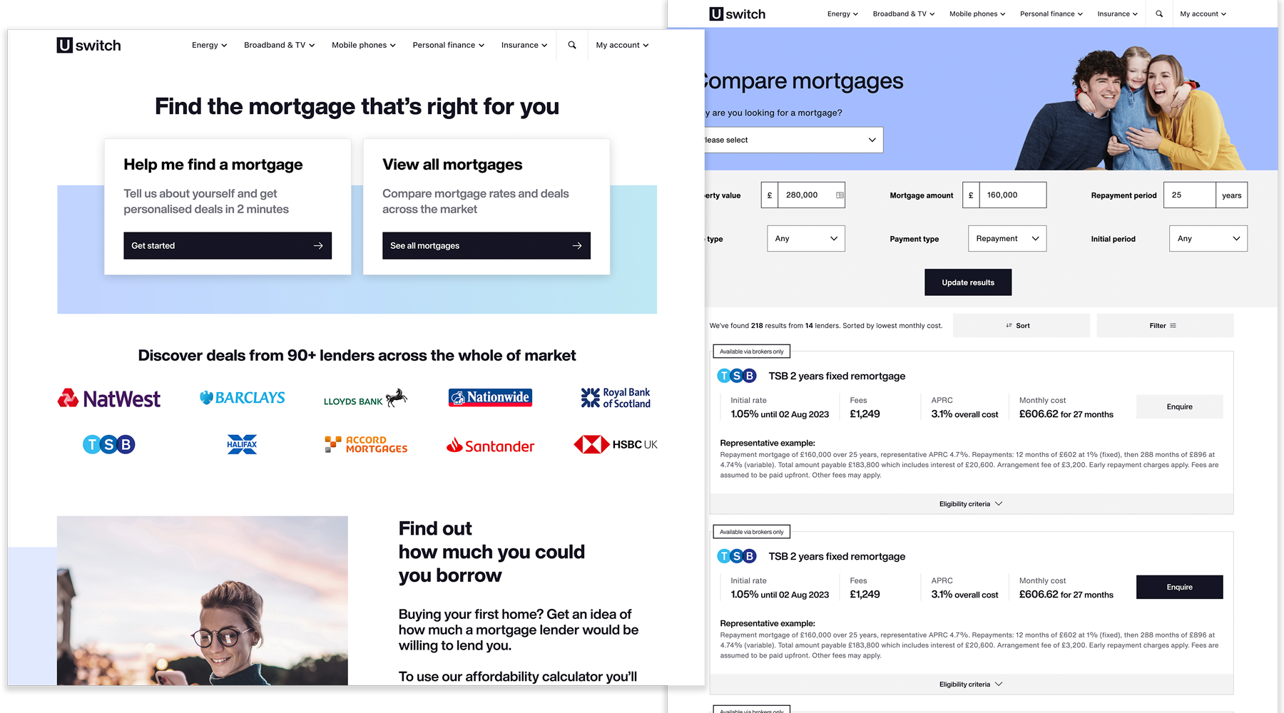
After several workshops and brainstorming sessions - led by me - we decided that it was necessary to surface more meaningful comparison results to our customers. The assumption was that if we were able to tailor our results table based on our customer’s needs, we would be able to interest them more effectively and generate more conversion. In order to do this we needed to ask our customers a few specific questions beforehand, hence the redesign of the Mortgages new homepage.
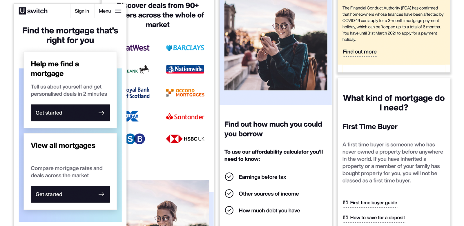
At the beginning we focused on one main journey: “Help me find a mortgage”. We also included two extra supporting journeys in order to exclude any dead ends and to keep customers interested: “View all mortgages” and an “Affordability calculator”.
The homepage was split into 8 main areas:
- communicate in real time — and from one single place — between all the warehouses and shops in their portfolio. They were looking for a piece of kit that could help them react promptly to any emergency
- Main journey CTA “Help me find a mortgage” through which customers would go through a question led journey, designed to filter our results tables based on customer’s inputs. Try the prototype below
- "View all mortgages”. This is where customers would land on our native page — our control A in AB testing."
- A section dedicated to all the Lenders included in our results comparison. This was to build trust in the eyes of our customer base.
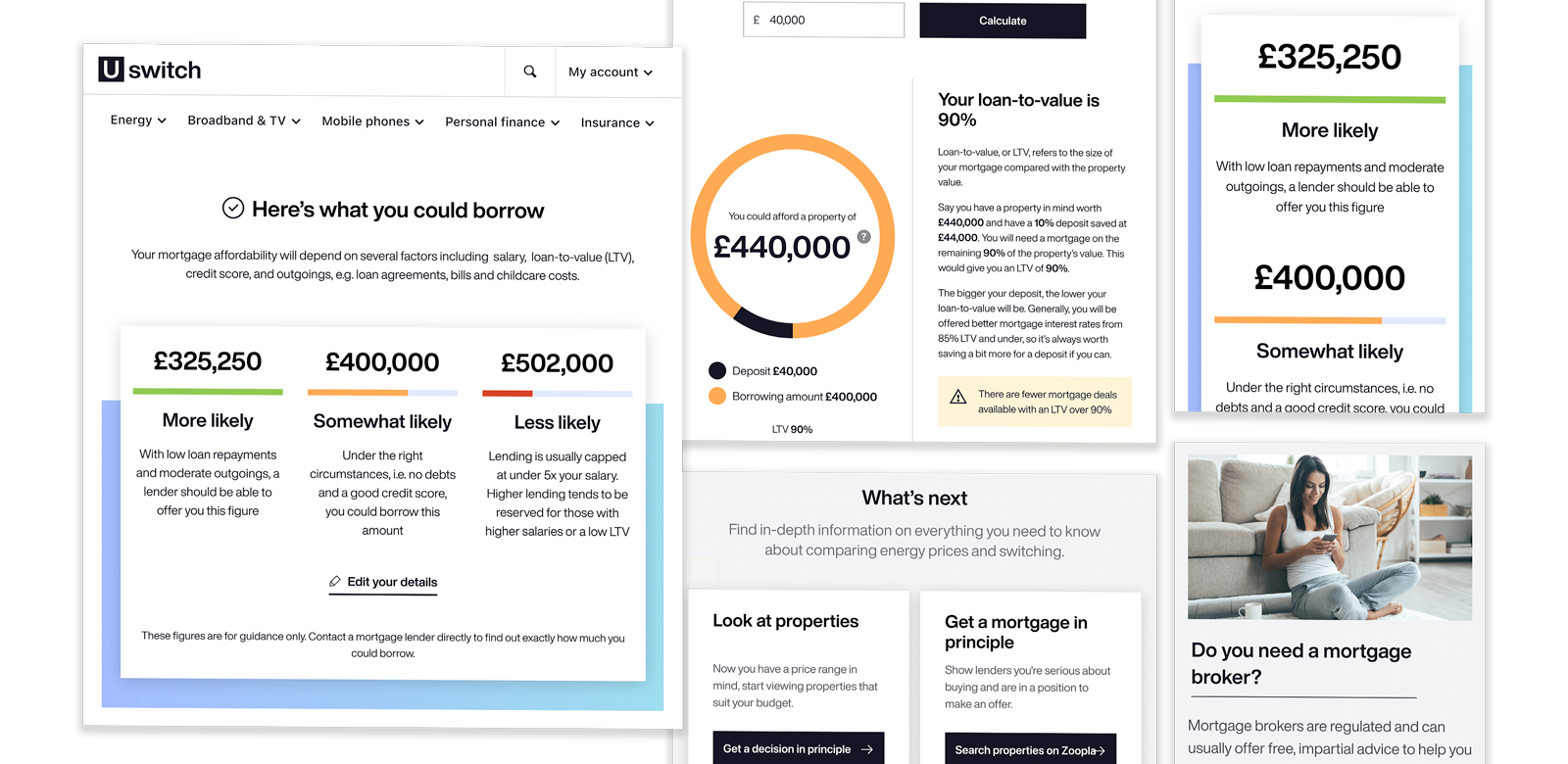
- A link to our “Affordability calculator” to help and support the decision making process.
- A section for live updates, to show that the Financial Services team was constantly updating the page.
- A brief snippet to explain “How it works”. Again to help in the decision making process and to build trust.
- Guides for help and support. If customers had scrolled to this point of the page how could we entice them to use our service? The answer was to provide them with as much information to help them make an informed decision.
- And finally SEO driven tabs at the bottom of the page (our mullet) with the double value of providing information to the customers and boost our rankings in organic search.
User-testing & the prototype
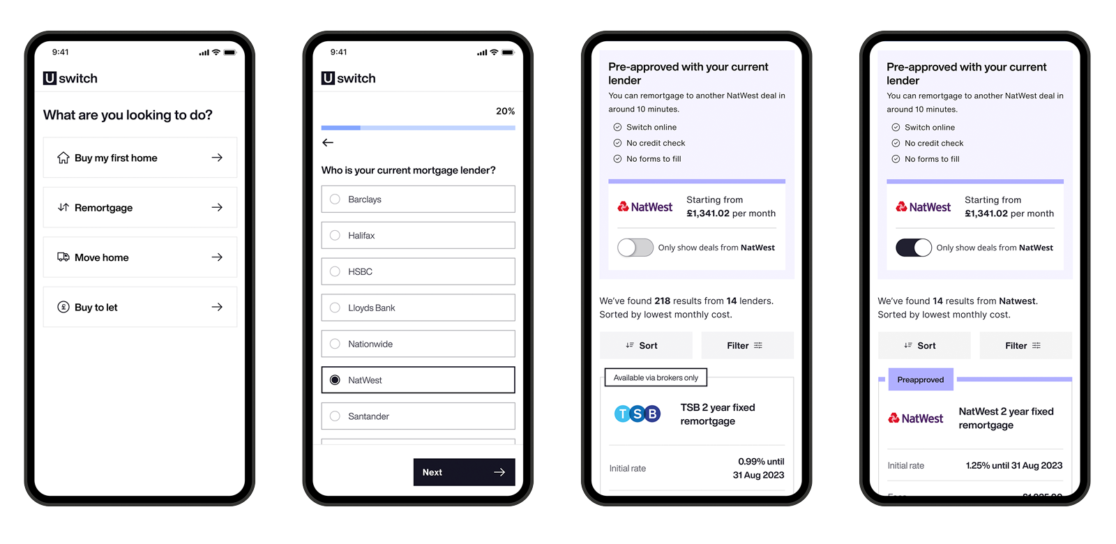
Once we formalised the final layout for the homepage and decided to push the remortgages section, I created the question led journey and prepared a prototype for user testing (see Figma prototype below).
As mentioned already Uswitch had a partnership with Natwest, this meant that remortgage was the ideal starting point and the shortest journey to test. To apply one had to be a Natwest customer, no credit checks were required and no formal application was needed as Natwest already had all the necessary information.
We also knew that with mortgages we were in a very privileged position as customers knew that they had to share some info (good data colletion for Uswitch), hence answer a few questions, in order to get reliable results.
All our tests both quality (user-testing with 15 customers interacting with the prototype below) and quatity (via AB testing) were very successful, so much so that the new homepage (variant B) definitely replaced the native one.
The current live Mortgages homepage has gone a step further. It has made the question led journey mandatory and has removed the extra click, for accessing said journey, by prompting right at the very top all four mortgages type CTAs:
- Buy your first home
- Remortgage
- Move home
- Buy to let
Results
6.7%
7.51%
4.75%


