A brand new Brand
In July 2019 Uswitch decided, after nearly 20 years, that it was time for a major facelift.
We wanted to reposition ourselves, in the highly competitive market of price comparison websites (PCW) and stand out from the crowd. Together with venturethree (branding agency), we began an intense journey to differentiate our brand, show our maturity and enable our customers to make the right choices for them. As our strap-line says: “Get more of what matters to you”.
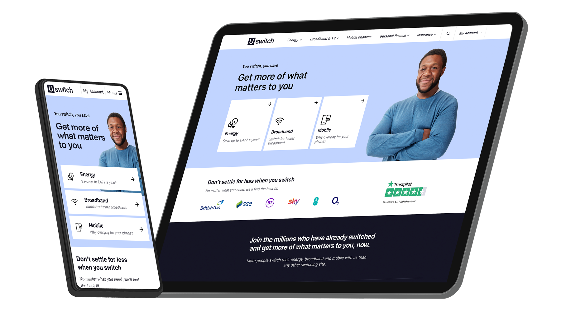
As lead designer of the project, I’ve been the main liaison both internally and externally, managing the project and the relations between us (Uswitch) and venturethree.
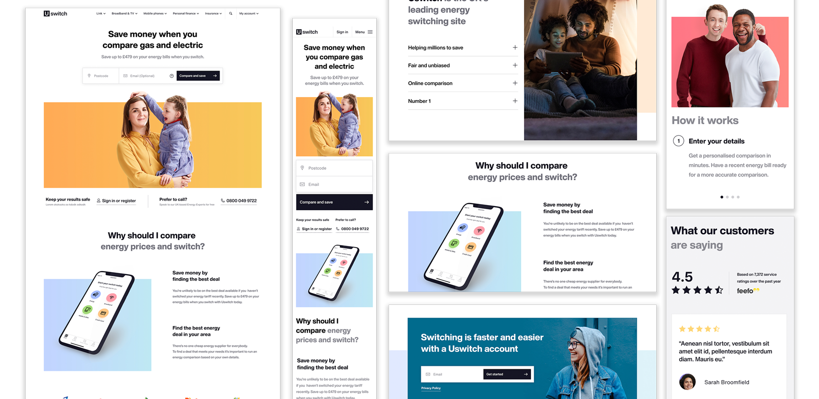
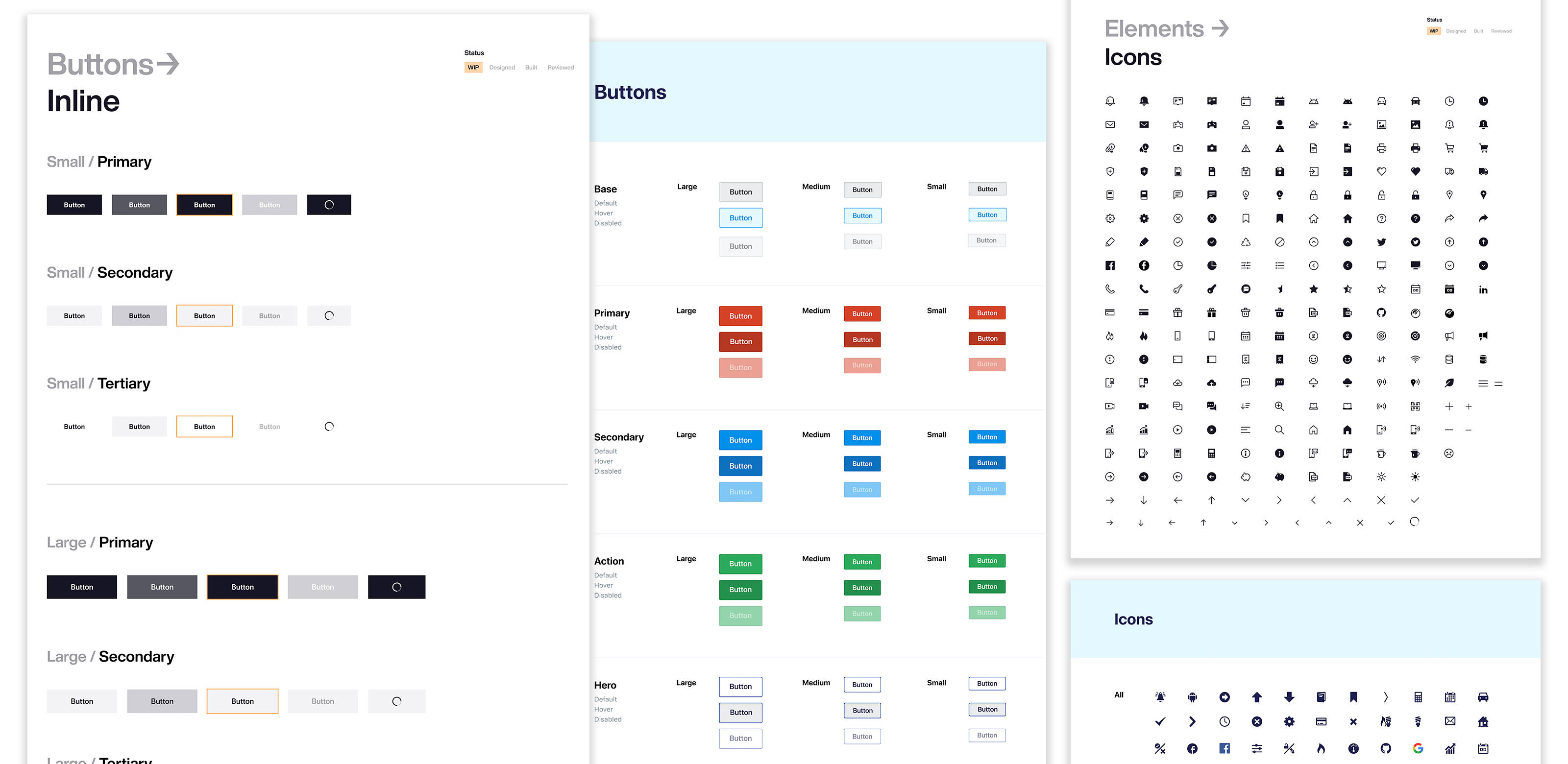
Amid other things, I’ve designed (with the help of my team) our new styleguide and playbook (phase 1), the initial re-skin of our website (phase 2) and we are now focusing on its complete re-design (phase 3).
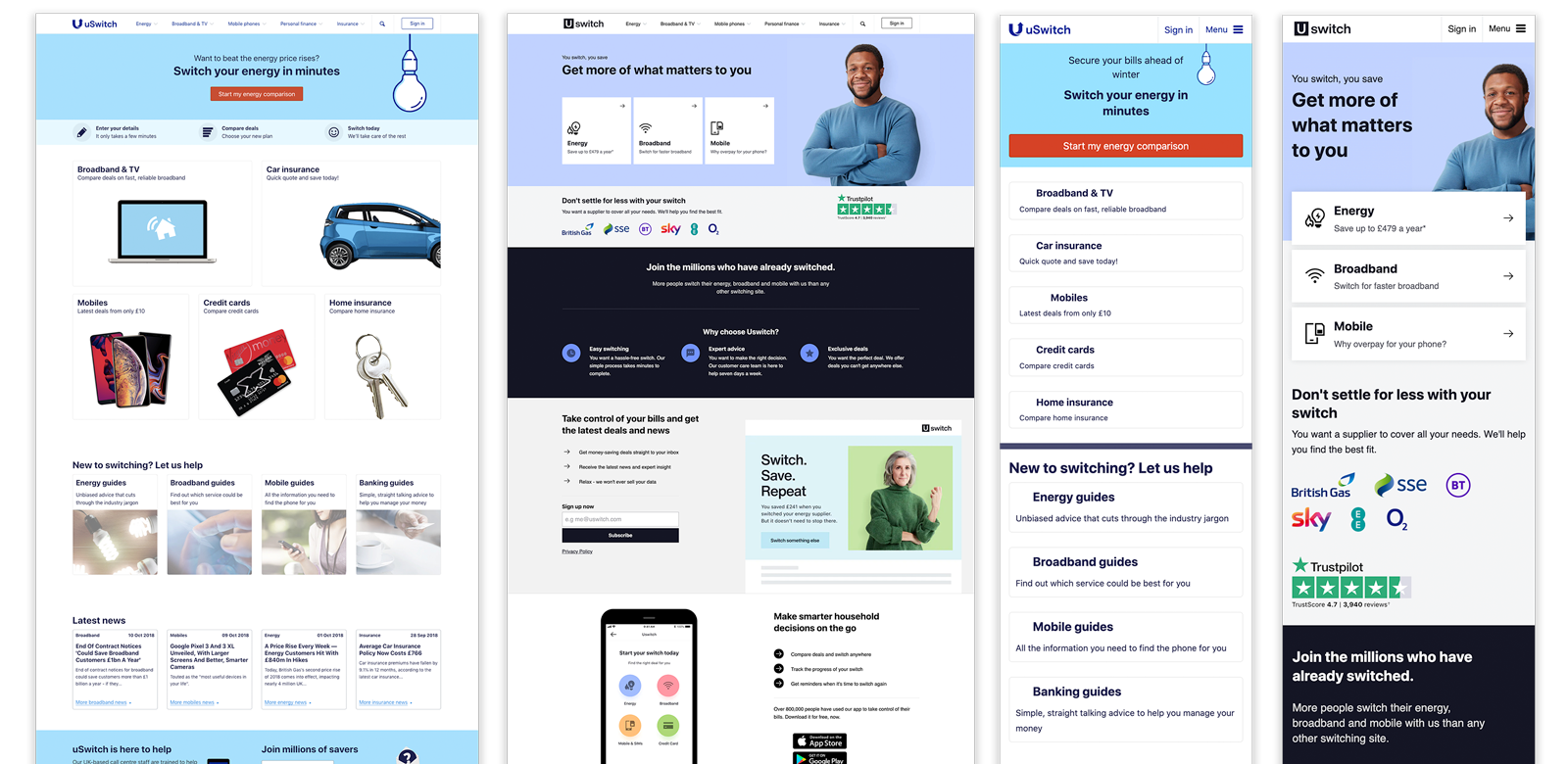
The re-skin phase (shown here) was tackled by replacing Uswitch’s style with all the new brand colours, fonts and Tone of Voice (TOV). We’ve adapted this on a like for like basis, transitioning from old to new, with a few minor tweaks.
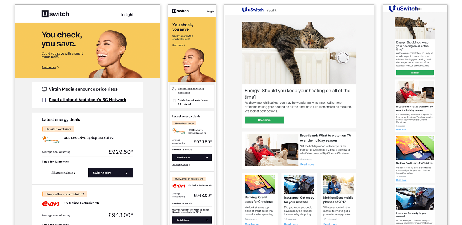
New vs. old newsletter template.
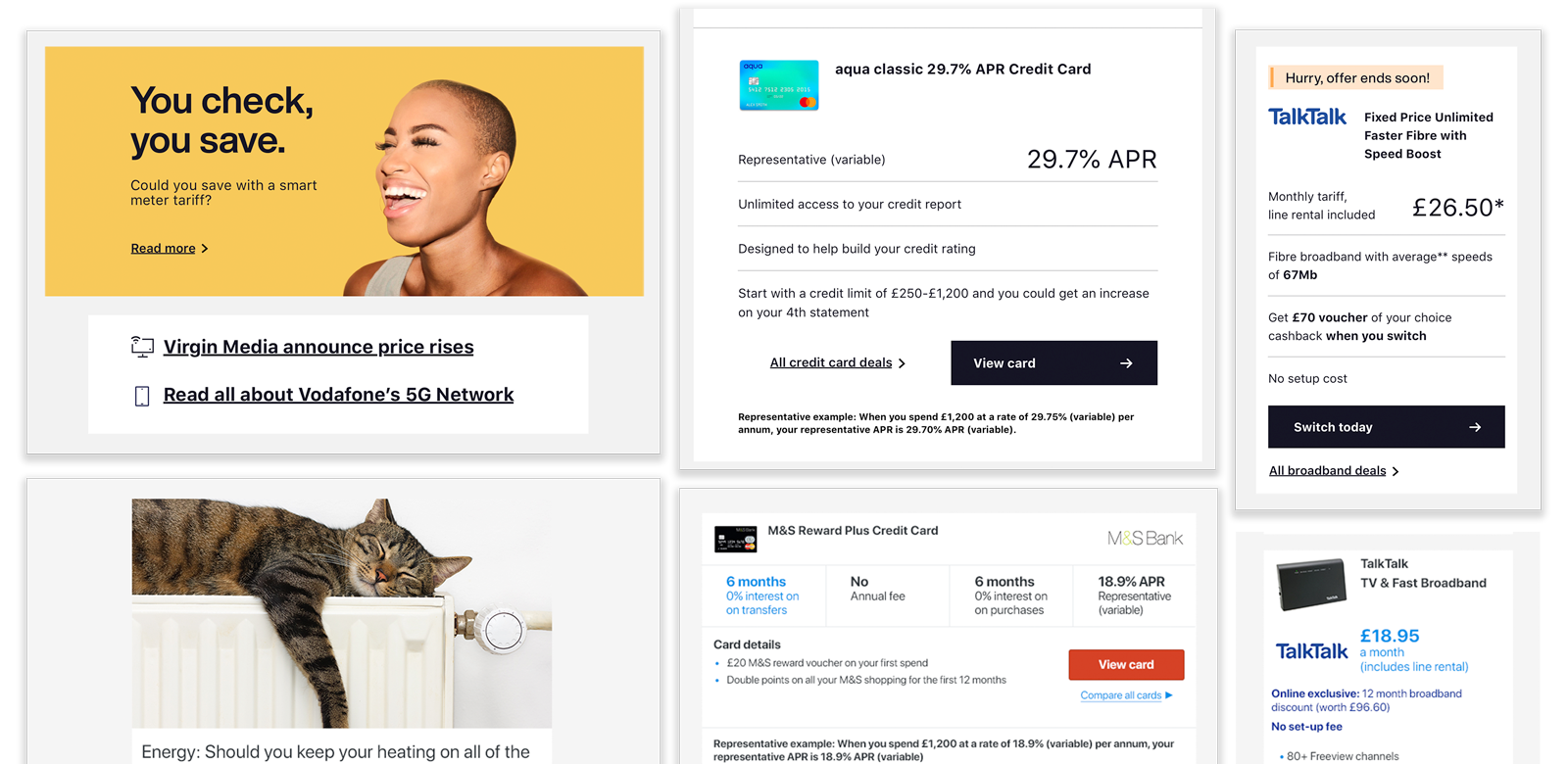
Both images, above and below, compare the two newsletter templates. The main differences are in the hero banner section, the typography and the product tables:
- The photography is significantly different. We've moved away from stock photography to seasonal bespoke photoshoots, to differentiate ourselves in PCW market.
- The section underneath the hero banner has become more of a teaser, whilst in the old version the entire section was quite imposing. This tiny change has registered a 4.02% increase in click through rate compared to the older version.
- The product tables are now clearer and less cluttered, enabling an easier digestion of the content, as the 3% increase in click through rate seems to confirm.
Results
6.35%

4.02%

3%


