Habitat Content Pages
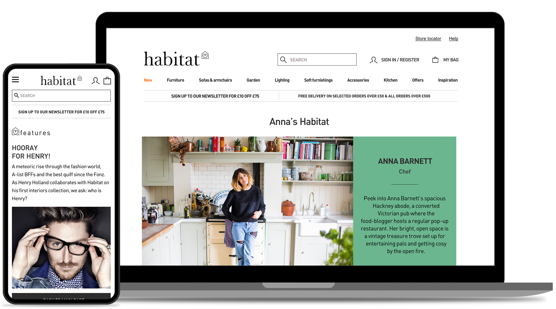
The following pages are a project I am most proud of: Habitat Voyeur and Habitat Features designed to boost the online sales of our high value furniture.

Our Furniture Designers were complaining about many products — furniture they'd invested a lot of time and thought in designing — as they were’t having the same traction online as in store. The general assumption (in the business) was that customers needed to “touch” these items before committing to a such expensive purchase.
At Net-A-Porter I learned that customers appreciated reading the online magazine, as it hepled them with their purchases. It was a source of inspiration, helping them understand the value of the product and enabling them to “shop the look”. Habitat did not have a magazine, or any type of content material to leverage in that way, so I thought we could create a similar journey here..
I formalised the idea, with several wireframes and after a little more than a month of A/B testing and relative adjustments, the pages started to generate a significant impact on our online store. In the first 6 months only we had a 3% uplift in sales of said furniture.

Structure & layout
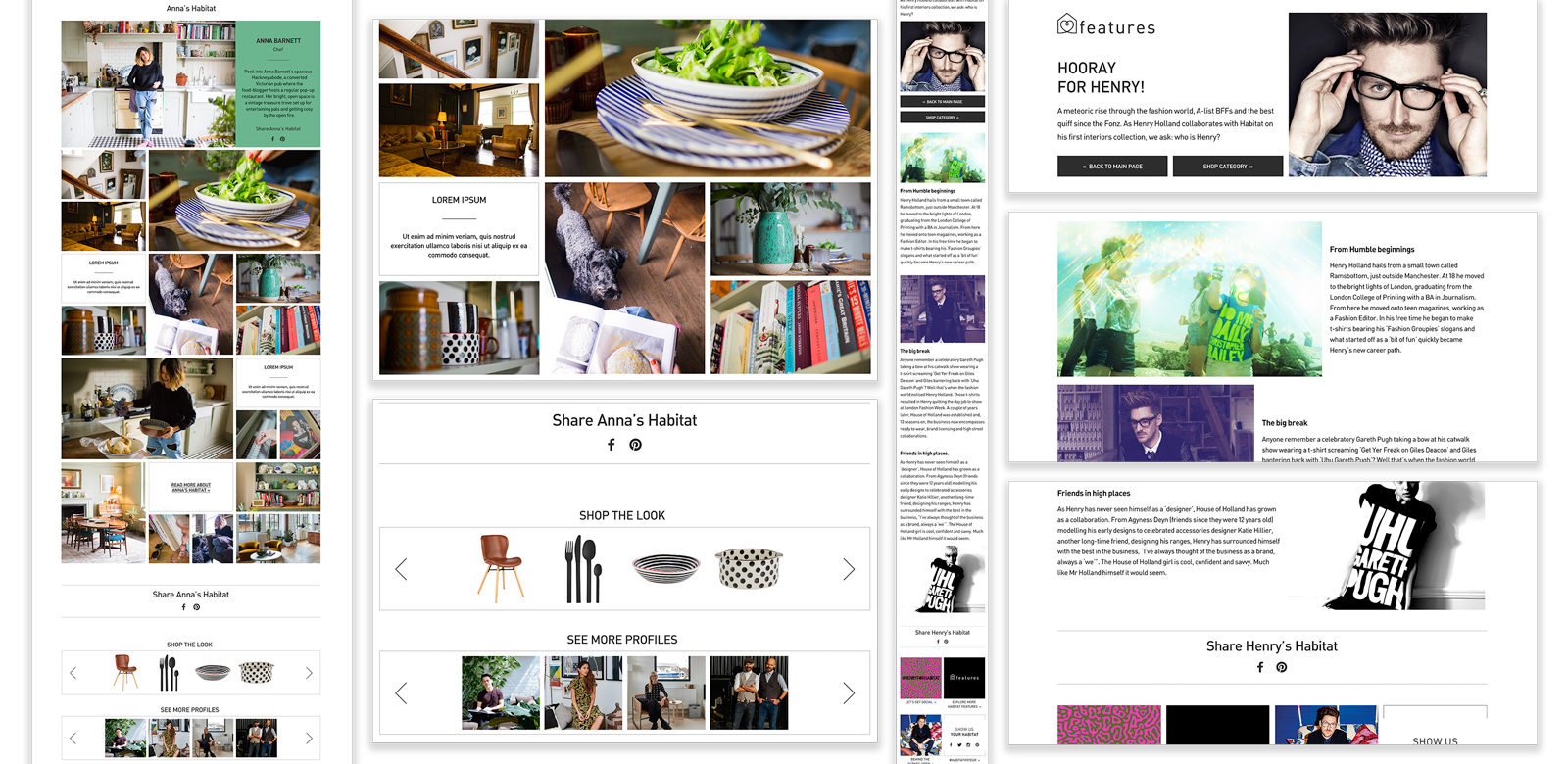
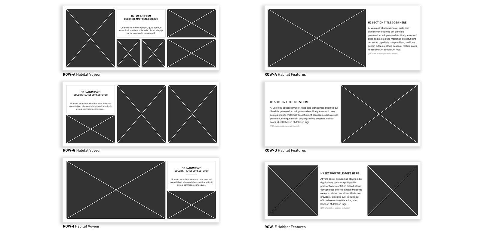
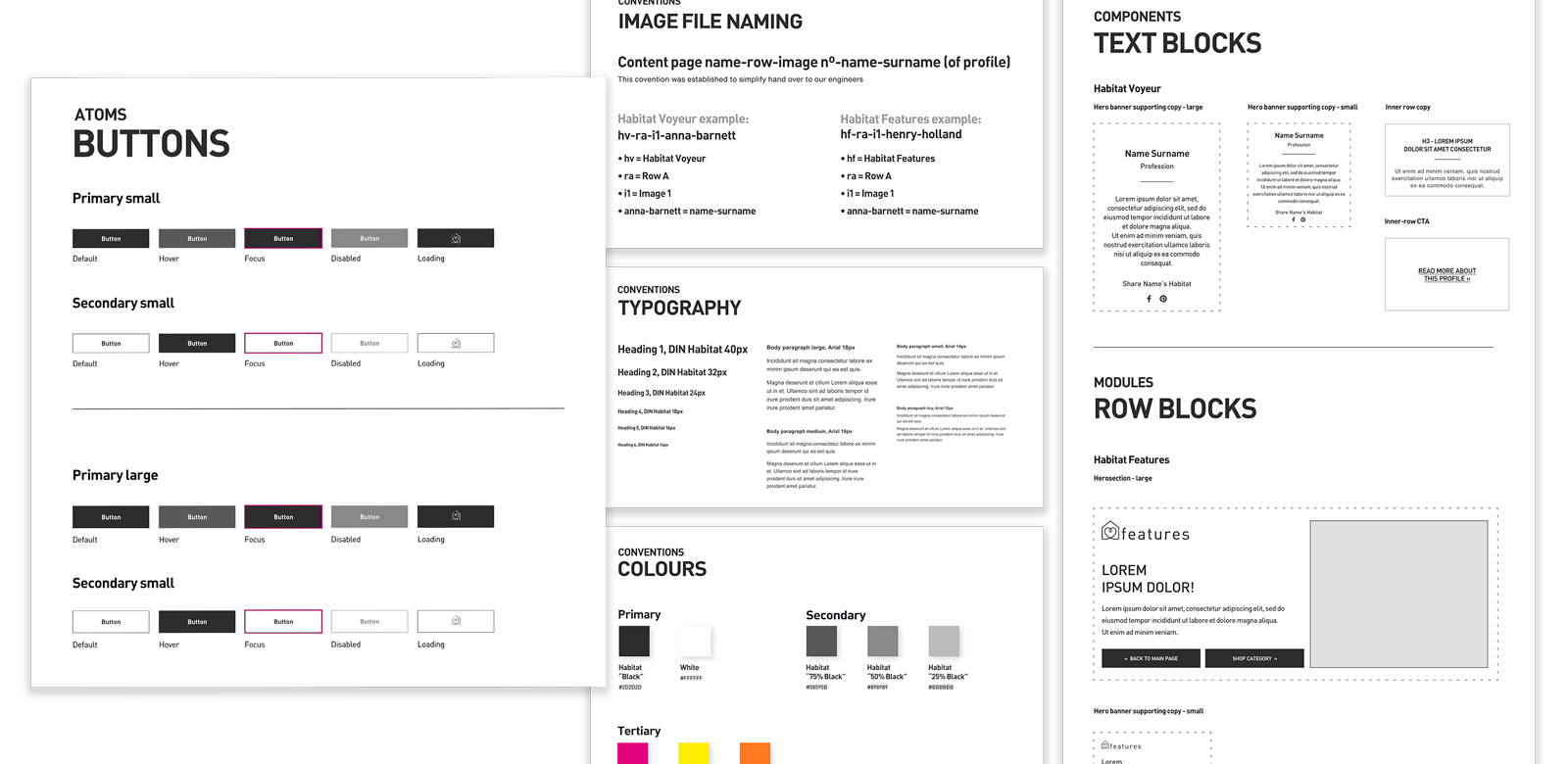
The images below illustrate the make up of these pages, basic structure, layout and the Design System.
The main rationale in their making was:
- A modular structure with interchangeable rows - 12 rows for Habitat Voyeur and 5 for Habitat Features.
- The articles were image lead, hence each photoshoot was planned to the smallest detail and directed by professional photographers.
- Each profile would serve as a source of inspiration, promoting a specific look to entice our customers to Shop The Look.
- The underlying Design System and components were then expanded and refined to cater for any new pages, we might plan in the future.


Results
3%


