Design that Connects .
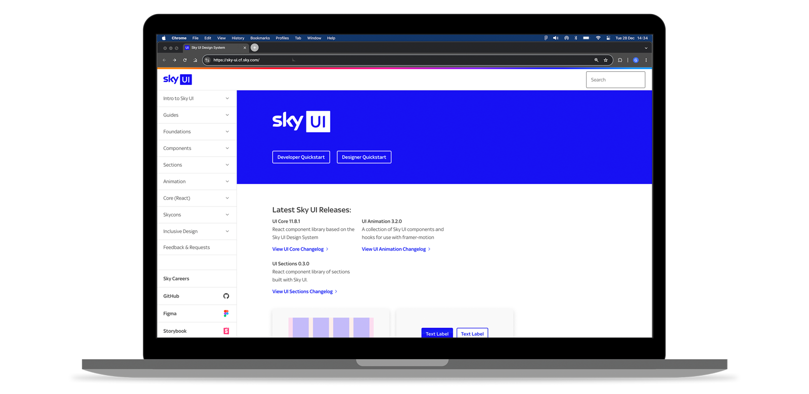
I lead the creation and evolution of Sky UI, the design system underpinning Sky’s digital ecosystem: a shared framework that reduces design debt, accelerates delivery and protects quality at scale.
Core business objective: increase speed and consistency without lowering craft, whilst improving accessibility compliance and support revenue outcomes across journeys.
Collaborators: head of design, designers across product teams, engineering leads, accessibility specialists and product owners.
The problem .
When I joined Sky, the challenge wasn’t that there was no design system. Sky already had one. The real issue was how it had been formed: it had been reverse‑engineered from whatever was already live on the website.
That sounds sensible at first, but it creates a subtle trap. If you build a system by copying production pages, you end up preserving all the inconsistencies, the workarounds and the historical compromises that got those pages shipped. You’re documenting what happened, not what teams need in order to design well.
User needs
- Less design and engineering effort (rework and debate)
- Even accessibility outcomes
Business needs
- Unique patterns and components to accelerate delivery
- Design debt reduction to reduce cost
Sky is an ecosystem — Sky Glass, Sky TV, Sky Broadband, Sky Mobile (which I lead) and Sky Assisted (a SaaS tool for store colleagues) — but globally, every team had built their own interpretation of brand, components and interaction behaviours. The result was duplication, design debt and too many inconsistencies.
So I framed the problem differently. It wasn’t “we need more components”. It was: we need a shared way of making decisions; something designers and engineers can rely to move faster and not second‑guess whether they’re doing the right thing.
Problem statement
Sky needs a scalable way to make UI decisions consistently across products, not a static library.
Defining success early .
Before designing anything, I made success explicit. Without this, systems become opinionated and political because people are debating taste.
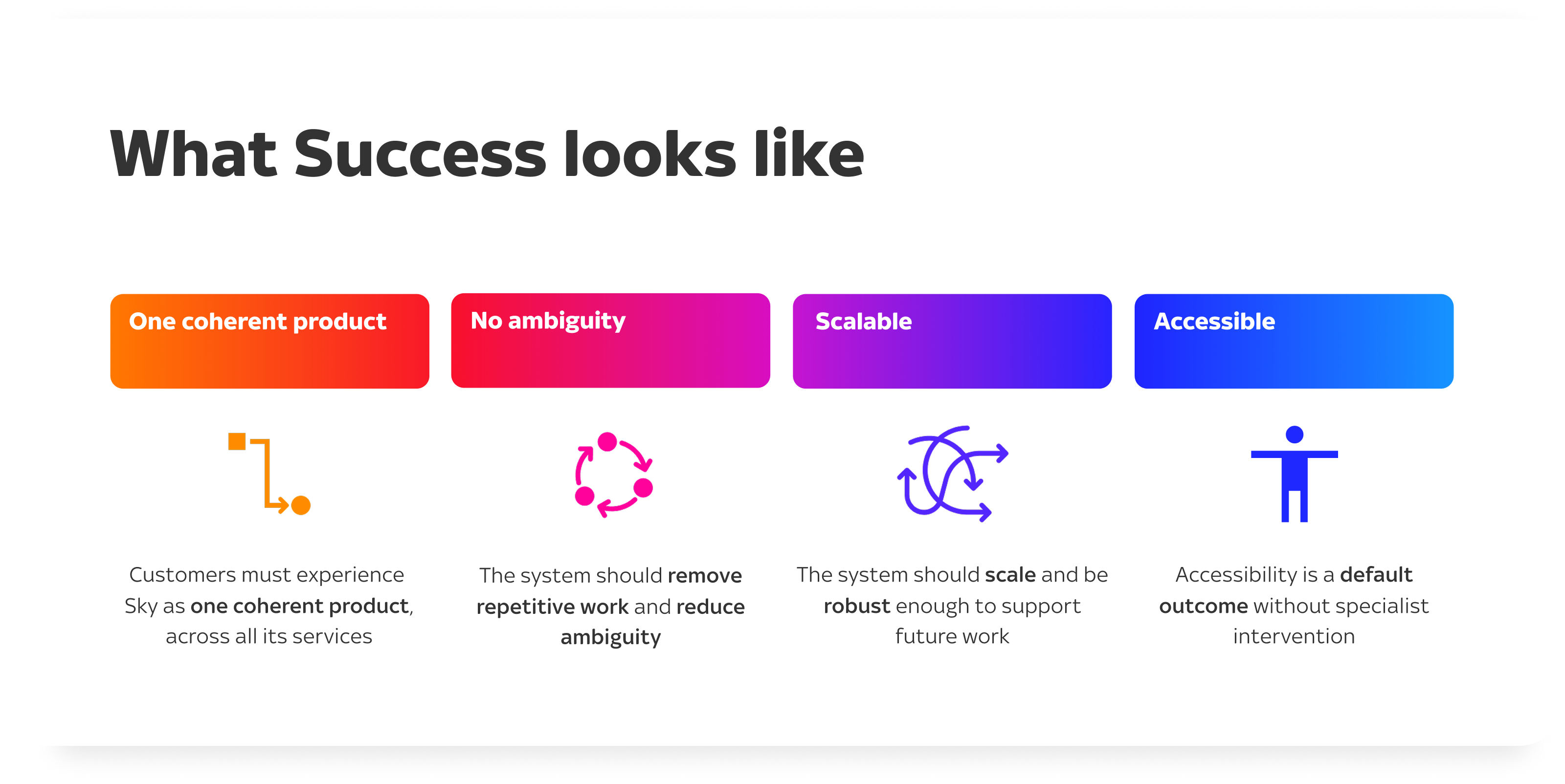
For Sky UI, success meant four things at the same time:
What success looks like
- Customers should experience Sky as one coherent product, even across different services
- Teams should feel supported, not constrained. The system should remove repetitive work and reduce ambiguity
- Sky UI should scale beyond the products it started with and be robust enough to support future work
- Accessibility had to be a default outcome, not an afterthought
These statements became the filters we used to make trade‑offs when the work got messy, which it inevitably did.
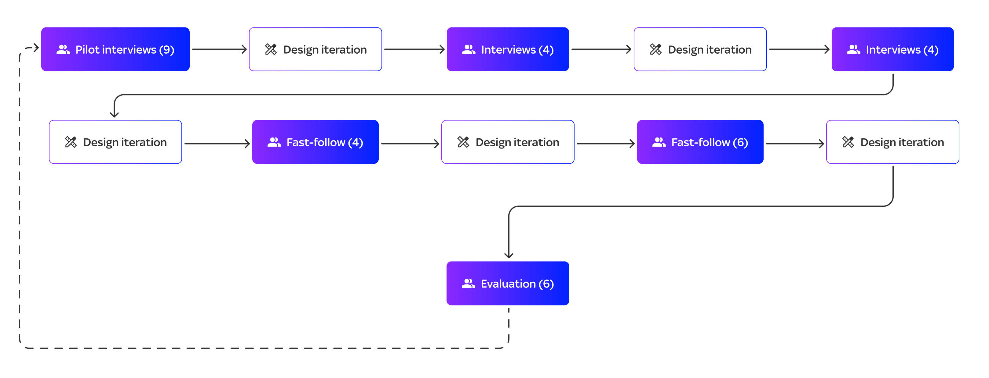
The research .
Discovery
I started with a system audit. What existed already, where it broke, where teams were duplicating and which parts were causing rework in design or in build. Then I spoke with designers, engineers and QA across squads to surface friction and I looked for patterns: repeated confusion, repeated re‑implementation and repeated debates.
I then mapped contributions. I found that when a team builds something locally, it’s often a signal that the system is missing a capability or that the existing pattern doesn’t work in real life. Alongside that, I studied other mature systems to understand the principles behind token models, governance and adoption. I basically wanted to create a system that could evolve safely over time.
My primary users are the internal design teams and this is huge advantage. Instead of waiting for formal research windows, I could learn continuously through critiques, workshops, implementation reviews and quick feedback loops.
User Pain Points
- Task analysis: how a designer or engineer uses the system
- Journey mapping: guidance → tokens → components → handoff → build → QA
- Friction clustering: recurring findings from critiques, support requests and implementation feedback
Acceptance Criteria
- Consistency: predictable behaviours across products
- Flexibility: composable organisms that adapt by context
- Scalability: rules that survive new use cases
- Accessibility and inclusivity: defaults that reduce cognitive load and support all users
How Might We (HMW)
As a result, I summarised these findings into clear How Might We.
They forced clarity and gave the UI team something tangible to test.
They also became the backbone of our iteration roadmap.
HMW turn the system from a component shelf into a decision framework teams trust?
HMW create tokens that scale across contexts and brands without teams forking styles?
HMW make accessibility outcomes the default, not an afterthought nor a separate work-stream?
HMW design mechanics so teams contribute back rather than working around the system?
Development .
Refinement through iteration
The work wasn’t a single build. It was a series of short cycles, each time returning to the success criteria.
I explored token structure options, from global primitives to semantic roles to component‑level tokens. I explored component architecture options, balancing variants against composition so we didn’t create an unmaintainable library. I explored governance options, deciding what needs review, how teams request patterns and how contributions are accepted back into the system.
I treated each pattern as a mini-product and every stakeholder check‑in was built around trade‑offs. How quickly do we roll out versus how complete do we need to be? How strict should we be without creating adoption risk? Where do we define “one pattern”, and where do we allow contextual composition?
Prototype behaviour (states, focus order, motion, responsive rules)
Validate with real tasks (designers and engineers using it in context)
Refine documentation until teams can self-serve without meetings
By being explicit, we avoided endless debates and moved forward with intent.
Documentation
I then optimised the documentation for speed-of-understanding:
- Clear purpose and “when to use”
- Anatomy and behaviour
- Edge cases and failure states
- Responsive guidance
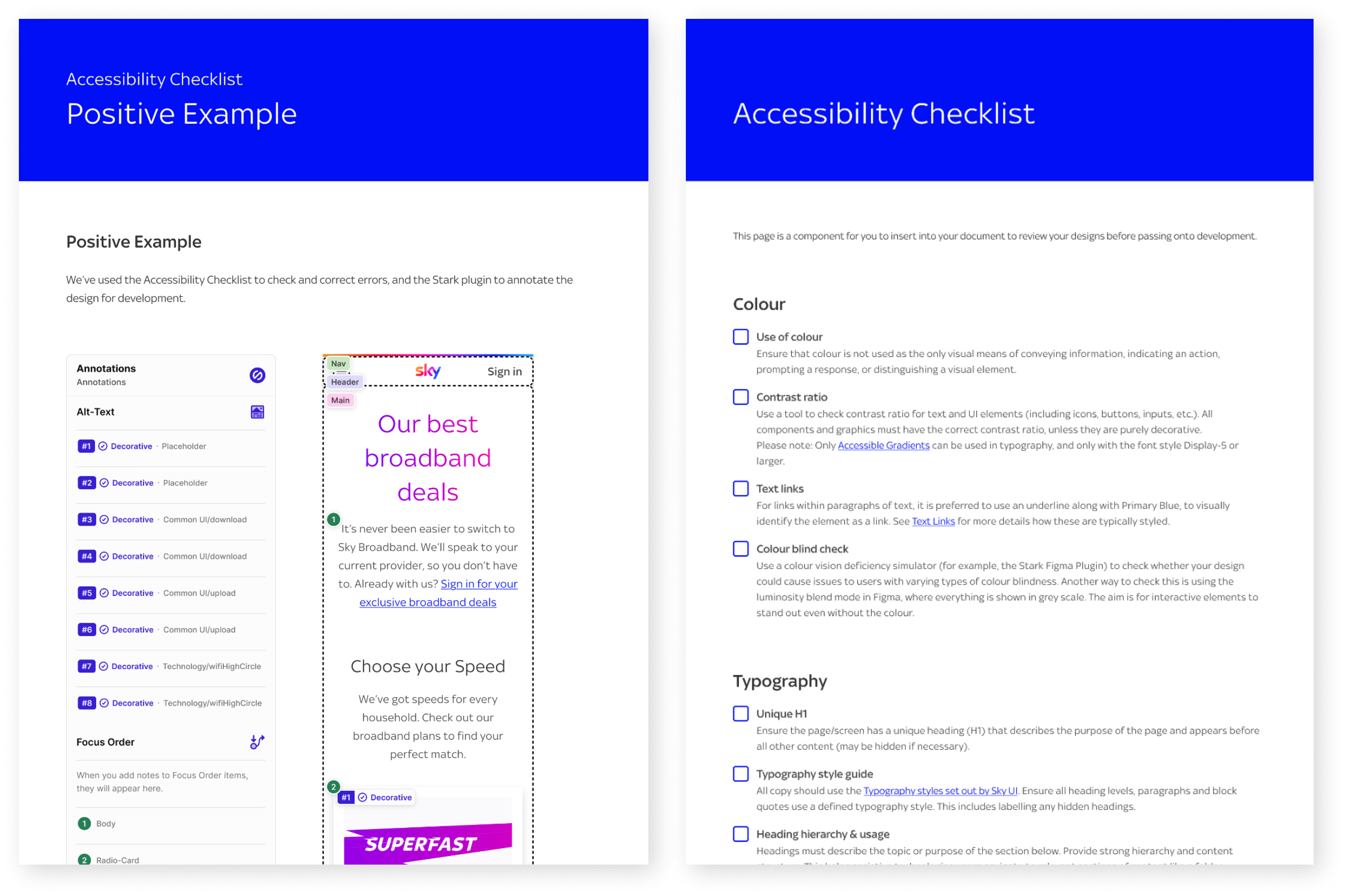
- Accessibility checklist and references
Test & validate .
Because our users were internal and available, I validated quickly and continuously.
I ran RITE‑style working sessions with designers and engineers where we would watch how they used the system to complete real tasks, then refine the spec immediately. Weekly critiques helped surface divergence early. Implementation QA with engineering and QA ensured the behaviour was correct in code, not just in Figma.
Testing
- RITE-style working sessions
- Unmoderated checks
- Card sorting
Validating
- Heuristic evaluation against our principles in order to catch regressions quickly
- Findability and comprehension of documentation
To strengthen the system over time, I also leaned on other methods that fit design systems well: tree testing and fast-follow QA to validate the documentation IA and findability, first‑click checks for discovery and SUS to quantify whether the system felt usable to the people who relyed on it.
Continuous discovery
Sky UI is not a "finished" product, it is a livng thing evolving because we continuously discover and iterate to make it better.
Signals come in constantly: critique feedback, implementation friction, support requests and, at times, some level of inconsistencies showing up in new journeys. I capture those signals into an opportunity backlog, frame them as hypotheses, validate quickly through prototypes or code spikes, then ship in small increments.
This aligns with Teresa Torres’ view of discovery as an ongoing habit: I keep learning from customers (designers in this case) and use the evidence to choose opportunities that drive outcomes and business value.
Teresa Torres
"A digital product is never done. Teams should continously keep discovering new products to solve unmet customer needs and keep iterating on existing ones."
Impact and why it matters .
The impact is most tangible in reliability and speed. Teams can deliver faster with fewer inconsistencies because foundations and behaviours are shared. Reuse increases. Duplicated build effort drops. Accessibility becomes more consistent because it’s encoded into defaults. The system is portable enough to support expansion beyond its original context, including Now.
And importantly, it changes how teams work. When one has a shared language and shared intent, collaboration improves, decisions become clearer and teams spend less time debating and more time shipping.
What I learned
The biggest lesson is that a design system scales through trust, not enforcement. Tokens and semantics matter because they allow safe change over time. Accessibility by default is cheaper than accessibility by repair.
What's next
The next phase is operational maturity: deeper token automation, tighter integration with engineering pipelines and expansion into more complex, data‑heavy components, plus service patterns that help teams build end‑to‑end experiences, not just consistent UI.
Results
~100%
88%


